
Friday, 22 March 2013


Thursday, 21 March 2013


Wednesday, 20 March 2013


Tuesday, 19 March 2013
Evaluation of Draft One against Draft Two
Our first attempt of filming was at Pozition Nightclub, this
proved to be unsuccessful due to the lighting of the club, the footage we
achieved was perfect for our video as it fitted with the genre codes and
conventions of RnB and our original idea to film in a nightclub was be to add
to the realism of the atmosphere of the video. The filming was too dark and
unclear to include, however after revising the video and creating a second
draft some of the footage from the first draft can be included. However by
using the theatre in college we can now create clear, accurately lip-synced
footage and include this in our video to make it of a higher quality and better
standard, some of the footage where the lighting is slightly brighter can be
used and we have included that in our second draft to keep the video
interesting and to show examples of different locations and also to reference
to the nightclub which is fitting with our genre and teenage target audience. The
clearer brighter footage gives the video a much more professional look.
By playing the music while filming we would able to get an accurate
idea as to how much of the song we had filming footage for and how long each
clip lasted and what we were missing, however what we did not identify which we
later realised when editing was that we needed to film the whole song through
so any footage we were missing we were able to fill in the gaps when editing. To
do this, we filmed the shots in the theatre that we needed and incorporated the
ideas that we had then following this, we filmed our characters, Laura and Kabi
dancing and singing solidly for the whole track we then worked of this as a
base and could use however much of this clip that we needed. It also meant that
we could use them dancing as a couple throughout the whole music video like a
motif throughout. It also enabled us to make the shots and ideas we had put in
place stand out more and editing meant that we could change and edit some of
the dancing shots by adding flashing lights, fades etc.
We decided to keep the same characters as they are fitting
with the genre we have chosen and they played the roles really well in the
first edit, it was frustrating that the lighting was too dark as some of the
shots were really great and we are disappointed we couldn’t use them but with
them being so unclear it meant that it made our music video look so much more
unprofessional. By completing our first draft of the video for the deadline it
meant that we were able to look over the video and identify the improvements
and clips that needed reshooting. This gave us time to do so for the second
draft.
The first draft proved to be really helpful for improving
the second draft and our knowledge of using the editing suite has greatly
improved and being able to change clips from the original video has been a really
positive change, I am happy with the improvements we have made.
Filming at Location One
Pozition Nightclub.
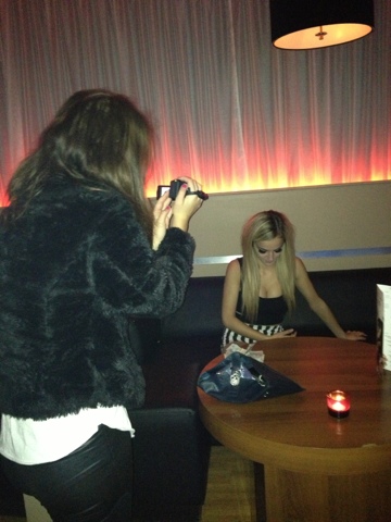
The lighting proved too dark for us to be able to continue filming at this location, we decided to recreate our original idea in the college theatre, which was dark and included dark curtains and flooring, however we were able to customise the lighting to our needs so the video could consist of a higher quality.
The lighting proved too dark for us to be able to continue filming at this location, we decided to recreate our original idea in the college theatre, which was dark and included dark curtains and flooring, however we were able to customise the lighting to our needs so the video could consist of a higher quality.
Conventions of a digipak
include:
- Main image of artist
- Name of artist
- Name of the album
- Warning of parent consent (if necessary)
- Image for the CD
- List of songs on the back cover


Friday, 15 March 2013
Change of Camera
The poor quality of the photographs I have taken is due to the use of a smart phone, this will require me to book out a digital camera from the college and take some more photographs as then they will be of a higher quality and more appropriate for my magazine advert. I need an image of the similar quality as the adverts I have shown as examples.
The Conventions of a magazine advert
- Image of the artist
- The name of the album
- A Realse date of the album
- Star rating of the album
- Image of the /logo/band symbol/record label
- Artist’s name
- Genre of the band reflected in text/colour/font/images
- Use of new media Persuasive/Eye Catching Text/Images
- Parent advisory label
- The title of the maagazine
- The date of the magazine
Improvements
I have identified that I need to take some additional photographs of my chosen character as the images I currently have are not clear enough or focused enough for my magazine advert. The images I currently have do not comply with magazine advert conventions in the way that i would like them to. I will take some more appropriate images and upload them before creating a second draft for my magazine advert.
Friday, 8 March 2013

Development of Magazine advert

Digi-pak research - Nicki Minaj Roman Reload


This is the digipak research for Nicki Minaj- Roman Reload, it includes the disc for the album and also the tarck names to the tracks on the album.
Magazine Advert Research 3

This is another example of an album cover from Nicki Minaj, the theme consists mostly of pink, the album anme being 'pink friday' is not suprising, he name is smaller and in white as opposed to pink and situated right at the top of the page suggesting she no longer relies on her artist name to be recognised, the image is large, dominating most of the advert and therefore this shows her image is iconic and people can recognise it without seeing her name. Her pink outfit and pink hair also suggests her image of 'barbie' but also links her to the album. This magazine advert is the most strongly linked to mine as it includes the artist i have chosen to make my music video on.
Magazine advert research 2

When researching different adverts for magazines i found this example of a recent album from rhianna, i chose to include it as she is from the same genre as Nicki Minaj and features mostly RnB music, her style is also excentric and unique however the use of balck and white on this advert almost illimiates that. However the use of red writing to help the album name stands out is useful to her target audeince. This breaks audiences expectations of what they expect to see for an advert for Rhianna's new CD album, however the iconic image showing vivid make up and lots of jewellery and her short iconic hairstyle agrees with audience expectations. This is a good example of how artists from the same genre can differ so much from one another.
Magazine advert research
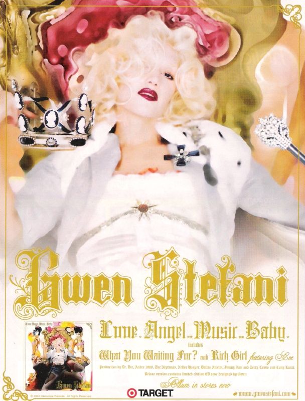
Similar to the CD covers, the magazine advert includes the artist name, the album name and an example of tow of the track names included on the album. The advert also includes an image of the artist and a theme colour throughout the advert, in this example the colour is yellow/gold. the use of the crown and white gown suggest royalty and this is emphasised by the colour gold for the writing. In the bottom left hand corner you are given a picture of the album in full, this is so the album can be easily identified by the target audience in shops for example. The text is simple but effective creating a proffessional overall image.

Pop Artist CD cover
This is an example of a pop artist CD cover, the use of colours such as yellow and bright blue and neon pink is similar to Nicki Minaj, the use of balck for the artist's name is also simialr to Nicki Minaj and the close up of the artists face is also very much like the artists i have included for the album covers of Nicki Minaj. This suggests her genre is slightly mixed between RnB and pop and therefore I am going to keep this in mind when creating my CD cover.
possible images for my CD cover
Here are a few example of the images I am considering using for my CDcover. the include images of my main artist, the images are close up featuring facial features similar to the artist Nicki Minaj. Some of the images include revealing clothing also which is reflective of Nicki Minaj and the RnB genre, i can incorporate colour and backgrounds into the album cover later using photoshop.


CD cover five

This is an example of a more traditional RnB album cover, it complies with the codes and coventions of this genre completely. The album cover is simlar to the first CD cover i have included an example of the model here is also stood with her legs apart suggesting sexual connotations, this is the same as Nicki Minaj in the first cover, The use of Red writing is bold and also connotes love and lust which are evident in the lyrics for a lot of RnB hits. the use of an expensive, white limo suggests fame and fortune and the use of cars is very prominant in RnB music video as it suggest wealth and fame. the use of a bracelt and ring suggest wealth also and is also portrayed in music videos as 'bling', this is also evident in a lot of Nicki Minaj's videos. The model is wearing a small white dress which does not cover much of her which is also simialrly done in the first Cd cover example I have included of Nicki Minaj. Nicki Minaj differs from this as a lot of her album covers include a close image of her facial features and expressions to appeal to her target audience. This album cover does not focus on one artist imparticular, i chose to analyse it as it follows the codes and conventions of the RnB genre. The cover also includes a stamp that says 'parental advisory' in the bottom left hand corner this is to suggest that the album may not be suitable for younger audiences.
CD cover four

This is Nicki Minaj's most recent CD cover example. Similar to my lasat example, shown in CD cover three this shows a close up of nicki minaj placed on a fuschia pink background. The use of yellow in the background to state her name helps it stand out to her target audience. Her hair is no longer bright blonde, however the style and volume is still iconic reflecting her excentric personality. her facial features include a curled lip which suggest attitiude but could also be seen as a reference to another sex icon which was Elvis Presley, who was known for this particular pose. This gives her an impression of power and dominance and also reflects her successful career. Pink is the main theme and colour included in this cover and many of her other album covers which i will consider when designing my own front cover. She is a well established artist and therefore her name does not need to be as bold as the album name as her face can be recognised without her name, i will keep this in mind for my CD cover also.
CD cover three

this example of an album cover of Nicki Minaj is very similar to the second example of her album artwork that i have shown in my previous post. The way she is posed with her mouth open and eyes closed is very sexual and through her music and photographs she is not afraid of showing this, this shows confidence. The use of bright colours again and the continuing idea of paint being splashed across the covers suggests a mess of bright ideas and her excentric personality, this time she is also covered in the paint making this even more obvious, more colours have been introduced, overlapping one another, and her name has been printed in black to emphasise her as the artist, this helps it to stand out from the background image and the song name. her blonde hair also still stands out and does not have any paint in which is keeping her iconic image as 'barbie'. Even though this image doesn't patricularly follow any of the conventions of the genre of RnB, it is still refelctive of her own unique style and ecentric image which i will keep in my mind when creating my CD cover.
CD cover two

This is another front cover of one of Nicki Minaj's albums. The image is again more dominant tahtn the text and this time the image focuses solely on her face, instead now her hair is blonde and her inspiration is barbie, the use of bright colours such as pink, orange and yellow suggest fantasy and i think this album would perhaps target a slightly more female based audience. The use of the effect of paint being splattered across the white background behind the image of her could connote her putting her own stamp on the album or adding colour, which generally her songs are upbeat and interesting so this could be the idea she was hoping to achieve. It could also connote her expressing her perosnality with the bright colours as often her outfits and music videos are quite excentric and they way she is portrayed is definitely unique from other examples of female artists. The text 'roman reloaded' is written in the effect of a paint brush which keeps a theme making the cover look professional. I will keep the idea of her style and genre of music in mind when creating the front cover as i want to ake sure i can include the bright colours and iconic image of Nicki Minaj visible when creating my own CD cover.
CD cover one

This is the CD cover of the single i have used for my music video, the image is the most dominant part of the cover consuming the majority of the space, the artists name are set in neon pink and orange to stand out. The colour is dark, showing navy and blues, her costume is an all in one animal print which is suggestive of her suxuality and also the lack of coverage suggests confidence and the outfit almost becomes iconic. The rrack is shared with 2 chainz, we can see him slightly on the cover however by dressing him in black this means Nicki Minaj is the figure our eyes are immediately drawn to and what we focus on. Nicki Minaj is quite a unique and abstarct atrist and soemtimes quite outrageous with her choice of outfits and song lyrics, here her outfit is revealing once again but also her stance is confident, standing tall but could also be percieved as slightly inappropriate by standing with her legs open wearing tight colthing around her bottom. Her bottom is quite iconic and therefore the lighting has been focused on this, this has been done purposefully. this is also emphasised by the fact we cannnot see her face this is suggesting that she is so well known by her image and her bottom that we dont need to see her face to know it is her.
Id like to use an idea like this for my subsidiary texts as it is not overcrowded, the image is refelctive of the artist and the writing is easy to clear, the song title is in bold and the artists are clearly stated.
The target audience is most probably young females that enjoy her music however by featuring 2 chainz on this track she expands her target audience to perhpas young males also. This particular cover could appeal to males also as Nicki Minaj is also seen by audiences as a sex icon.
Subscribe to:
Posts (Atom)